The primary aim of Quintagroup is to provide its clients with the up-to-date and effective web-based solutions following individual approach. Responsive website design is an essential and proper approach towards creating mobile website design.
And the Prize Goes to Mobile
Suppose Academy Awards were conferred annually to the gadget producers whose state-of-the-art inventions influenced our lives in all possible positive directions. Suppose the nominations covered those devices that made our hasty lives a bit easier due to their innovative functions - in both cases the prize would go to mobile devices.
Some time ago not all of the people had a chance to reach each other in case of emergency, or to share the burst of positive emotions immediately after something important happened in their lives. These and many other everyday situations together with the ever-growing pace of today’s life stipulated the invention of mobile devices. At first large and impractical, these gadgets quickly developed into tiny and multi-faceted ‘human helpers’, and now it is even difficult to imagine how we would cope without them. They have gradually turned from being luxuries to the objects of everyday needs and are extensively used in all spheres of our lives - personal, business, entertainment, studies, travelling, etc. If we were asked which devices would most probably ‘die out’ in the future, our answer would definitely not be ‘mobile phones’, because the future itself goes to mobile...
Getting Mobile-Responsive
Since mobile devices are designed to facilitate our lives in as many different ways as it is only possible, technologists are in their turn striving to facilitate mobile operation and extend its functions to the full.
With the emergence of all-embracing mobile functions, including installed digital camera, navigation systems, documents and contact management solutions, and, most importantly, the access to the world wide web, mobile technologists and designers are now trying to optimize the screen capabilities to all of these needs. The way out sounds simple, reliable and friendly - responsive website design. Let us now have a closer look at the operation of this ground-breaking solution and its implementation in the world of gadgets.
Why responsive website design?
Responsive website design is actually applicable to the whole multi-device environment we now live in. In the past website developers were creating several patterns for a website - desktop browsing, mobile browsing, and sometimes also tablet browsing. However, each website differs in the content essential to convey and design solutions serving as the face of the brand. This point requires in-depth individual analysis and approach on the part of web designers and developers. Responsive web design in its essence goes about building the pattern once and then allowing the site to adapt to the screen size depending on the device used. This technique saves both your time and the time while your device is ‘thinking’, and prevents you from switching to the wide range of patterns designed for each site whenever you want to change your site location.
How does it work?
Observing the technical characteristics of this type of design, it relies heavily on a bit of code called the media query as a part of CSS3 specifications, which inspects physical characteristics of the device we are working on. The query is, in fact, two-componential: it examines the media type (with screen capabilities) and some particular media features (max device width). Whenever the inspected device passes the test suggested by the media query, the relevant CSS (Cascading Style Sheet) is applied.
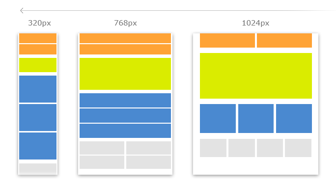
Media query helps target minimum or maximum screen widths in order to display different site layouts. One site could have a number of configurations of the same content, each adjusted to a different viewing context.
The following sreenshot illustrates the layout switch depending on the screen width:

Mobile First
Promptly after the notion of responsive website design emerged, the tendency towards creating mobile versions first has appeared due to ever increasing usage of mobile devices for browsing. The mobile version should contain all of the most essential content and be the “purest”, “true” version. Starting with the most focused context, designers can more quickly distinguish important messages and themes that influence the whole content creation process.
Examples
- Mobile Web design and Plone theme: WiKID Systems
- Mobile Website design and Plone theme: Phoenix Investment Adviser LLC
- Mobile web design and Plone theme: The American School Foundation of Monterrey
Would you like to know more about mobile web development and responsive website design implementation? Interested in how to make a mobile website? Contact Quintagroup and we will suggest the most responsive design for your website!

