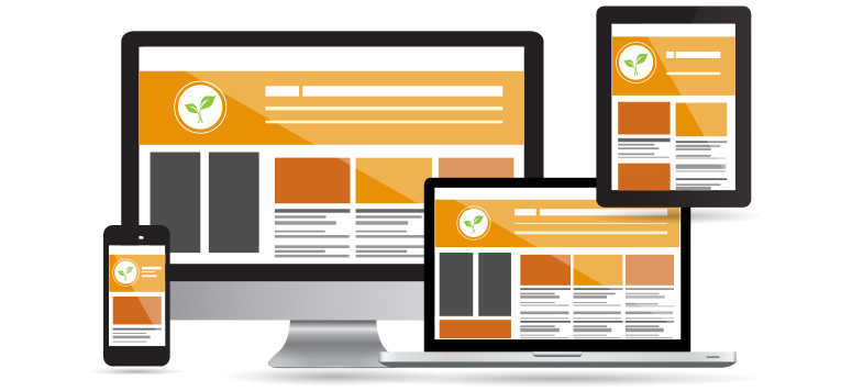
Recently more and more people have started surfing the internet using their handheld devices, in turn designers have been trying to come up with the best way to provide users of both mobile devices and computers with quality browsing. When web capable phones first gained popularity the method was to build a mobile version of the website. But that generally lessened the web experience for mobile users because the site would be so plain you would think it was coded with chisel and stone. That was then, now everyone is switching to Responsive Web Design, a new starlit in web development.
So, what’s a responsive web design?

Responsive web design refers to a site capable of reshaping itself depending on various screen sizes and resolutions, from largest on the computer to smallest on mobile device. This approach was first introduced by brilliant Ethan Marcotte in his article, on a List Apart. Compared to other techniques responsive web design uses CSS media queries and multiple cascading style sheets to change the layout of the website accordingly. Moreover, you can have different displays and layouts depending on the device orientation such as a tablet switching screen modes from landscape to portrait at user’s whim. This method of web design is meant to give the user the best experience with content visual display on the device or platform that they are viewing it on.
The core ingredients of responsive web design are:
- Responsive, grid-based Layouts
- Responsive Images
- Media Queries
Responsive Layouts
With responsive layouts your page is no longer left to its own devices. Such a technique attempts to adjust the layout to the great variety of screen environments. Rather than working with only the "most common" display dimensions and an "average" user, a responsive layout adapts to different viewing conditions and user requirements. By introducing alternate layouts tuned to each resolution range, we can enhance overall viewing experience.
Responsive Images
But a responsive design isn’t limited to changing the page layout only. It’s quite understandable that allowing images to adjust is very important and there are a few ways to achieve it: you can resize the image proportionally, or dynamically crop it. By using responsive web design you allow for this to be done automatically.
Media Queries
Media queries are a good solution for developing highly responsive websites to view on mobile devices. With media queries, designers can build multiple layouts with just HTML documents and choose the right style sheets based on different criteria such as size of a browser, screen resolution. So, instead of looking at a device type, they consider its implemented capabilities. But this is only scratching the surface. Working with the media queries, we can alter much more than simple placement of an image. Media queries enable us to do fine-tuning as our pages resize themselves: we can increase the target area for links on smaller screens; show or hide elements to make the navigation more prominent, we can even apply responsive typesetting to optimize the reading experience for the display providing it.
Become responsive
Responsive web design is a way forward, allowing us to “design for the ebb and flow of things”. Switching to a responsive website is a win-win scenario for both developers and clients. Not only does it help to set and maintain a consistent look and feel on myriad devices, but also decrease the cost of doing this. So, why exactly is responsive design so appealing to web designers, marketing strategists and CEOs alike?
Pros of Responsive Web Design:
- One website to maintain: It is so much easier to add and manage the page layouts for new devices than it would be to build and manage separate sites, optimized for different devices.
- Search Engine Optimization: SEO authority will not become diluted as all links and bookmarks point to one URL.
- Social Media / Sharing: If a user shares the site, the recipient will always get a similar experience, as there is only one URL.
- Improved User Experience: Responsive design isn’t just about what device is used. As people tend to have their browser not in a full-screen mode, with responsive design, you’ll never get a horizontal scrollbar.
As any new approach, responsive web design is delivered with its own set of hedges to go through. Although there is undoubtedly a lot of work involved, the advantages clearly overshadow the disadvantages; which is why we, at Quintagroup are in the process of developing responsive websites for a number of our clients.
Examples
- Responsive Web design and Plone theme: WiKID Systems
- Responsive Website design and Plone theme: Phoenix Investment Adviser LLC
- Responsive Web design and Plone theme: The American School Foundation of Monterrey
We hope you enjoyed this article. And if you are interested in making your website future-ready, we offer a wide range of services, catered towards developing and designing a responsive website. Please feel free to contact us anytime should you have questions.

